The shop admin shows it every morning: a list of abandoned checkout notices. People found the product, added it to the cart, started checkout, sometimes typed their email and address, and then left. Traffic is fine, product pages seem to work, and the shop goes quiet exactly at the step where money should change hands.
The usual conclusions are that prices are too high, that the shop needs more advertising, or that a discount pop-up will solve it. Some carts will always be left, because people compare and save things for later. But the part you can fix comes from a few familiar causes, and you can find yours with one test order and an hour of reading your own data.
Why abandoned checkout happens
The full price appears too late. Shipping, payment surcharges and extra fees show up only at the last step, after the shopper has already decided what the product costs. A bigger total at the end feels like a trick, and the shopper leaves to compare. The sign: shoppers stop at the step where shipping is calculated.
The checkout asks for too much. A forced account, a long form, the same address asked twice, a phone number required without a reason. Each field is a moment to reconsider, and on a phone each one is harder. The sign: shoppers stop at the contact or delivery details, more often on mobile.
The payment method they expect is not there. Shoppers in different countries are used to different ways of paying: a card, a bank app, a wallet on the phone, paying later. When their usual way is missing, they often do not switch to another one; they leave. The sign: shoppers stop at the payment step, and more of them come from one particular market.
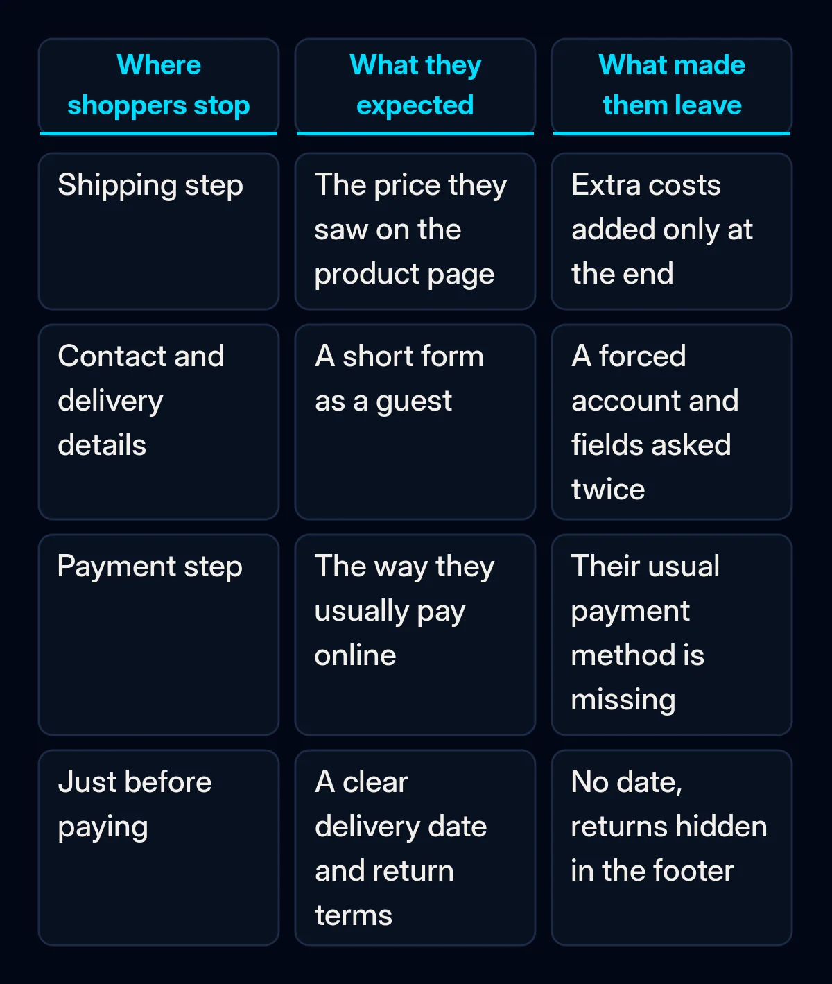
Delivery and returns are unclear. No delivery date, no pickup point, a returns policy hidden in the footer. The shopper cannot tell when the parcel will arrive or what happens if it does not fit. The sign: customer service gets questions about delivery and returns from people who have not ordered yet.
Something breaks or feels unsafe. An error on one browser, a slow payment page, a jump to a payment page that looks nothing like the shop, a coupon field that sends people off to search for codes. The sign: shoppers stop at the same step on one type of device, or error messages appear when you test.
We covered the wider version of this problem, when visitors do not even reach the cart, in why website visitors are not converting. This article stays with the last metres before payment.
How to tell which one is yours
Set aside an hour. Go through the checks in order; the first one that fails is usually where to start.
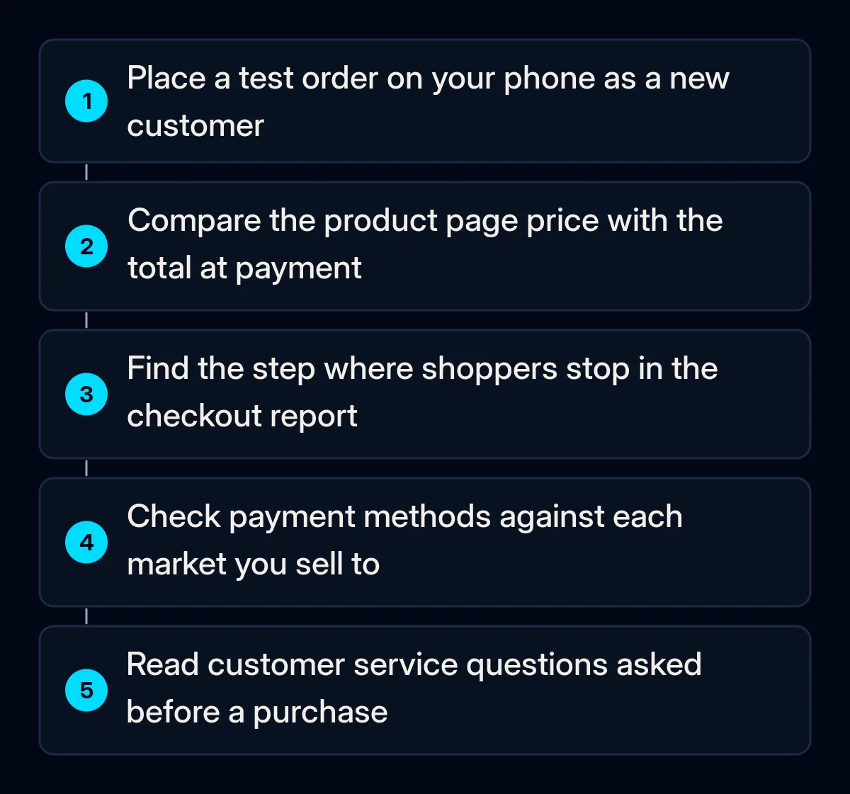
- Buy from your own shop on your phone, as a new customer. Use a mobile connection, a browser where you are not logged in and an address in a country you sell to. Write down every surprise, every extra field and every moment you hesitated.
- Compare the price on the product page with the total at payment. Every addition between the two is a reason to leave; note where each one first appears.
- Open the abandoned checkout list or checkout report in your shop platform. Look at which step shoppers stop at and on which devices. Where the drop concentrates matters more than how big it is.
- List your payment methods next to the countries you sell to. Ask a few customers in each market how they normally pay online, and check whether that method is on your payment step.
- Read the questions customer service received before a purchase. Questions about delivery, returns and payment show what the checkout fails to answer on its own.
The fix, in order
Cheapest first. The early steps are settings and copy, not a new shop.
- Show the full price early. Put a delivery estimate on the product page and in the cart, and make the total in the cart the total the shopper will pay. If a fee cannot be avoided, say so before checkout, not at the end.
- Cut the form. Allow guest checkout, remove fields you never use, ask for the address once, and make the phone number optional unless the courier needs it. In our online shop projects a test purchase on a phone from each market is part of the launch list for exactly this reason.
- Add the payment methods your markets expect. Shop platforms and payment providers usually let you switch on local methods per country. Start with the market where shoppers stop at the payment step.
- Put delivery and returns next to the pay button. An expected delivery date, pickup options if you have them, and the return conditions in one short line. This removes the questions shoppers would otherwise leave to ask.
- Fix errors and keep the payment step familiar. Test checkout on the browsers and phones your shoppers use, keep the payment page visually close to the shop, and hide the coupon field behind a small link so it does not send people off searching for codes.
- Only then set up recovery messages. An abandoned checkout email or message with the cart, a clear answer about delivery, returns and payment, and an easy way back. Keep a discount out of the first message. Reminders work best when they are part of the customer record, which is why we build them inside CRM and email automation rather than as a separate plugin, so a shopper who already bought is not chased.
What to measure
- Started checkouts that end in a payment, read weekly in the shop report, step by step; this shows whether the change you made moved the drop.
- The step where shoppers stop, compared before and after each fix; a fix that works moves the drop away from that step.
- Orders that come back after a reminder, checked monthly; if they are very rare, the reminder is answering the wrong question.
- Pre-purchase questions to customer service about delivery, returns and payment, reviewed monthly; fewer questions means the checkout answers them itself.
Where we come in
A shop owner who runs a test order on a phone and reads the checkout report can fix abandoned checkout in small steps on their own, and this order is meant to make that possible. What we bring is a checkout reviewed market by market, the payment and delivery setup that fits where you sell, and recovery messages connected to your customer data so they help instead of annoy. If you want us to go through your checkout with you, a short brief is enough to start.